

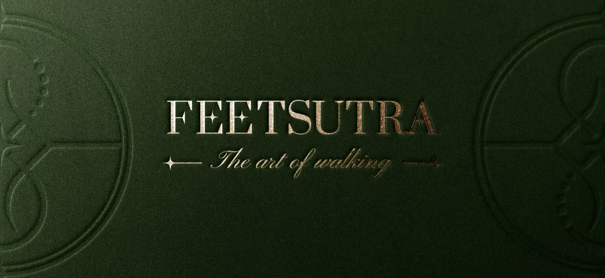
FEETSUTRA
BAREFOOT SHOES
FEETSUTRA
BAREFOOT SHOES
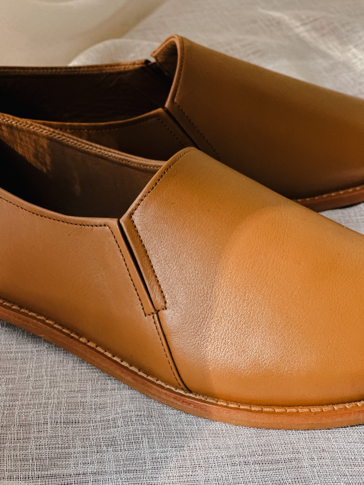
Feetsutra is a barefoot shoe company in the U.S. with it's roots in India, that blends the art of traditional Indian shoemaking with modern health-focused footwear. Feetsutra brings to life a range of shoes designed to improve foot health by encouraging the natural primal style of walking of a human being. With a focus on leather and suede materials, Feetsutra caters to individuals who seek luxury without compromising on the health benefits of barefoot walking.
type
CLIENT
Year
2024
Category
BRAND identity
& PHOTOGRAPHY
BRAND identity
& PHOTOGRAPHY
images
photographed all the product images shown in the project
what are barefoot shoes?
what are barefoot shoes?
what are barefoot shoes?




the objective
problem statement
the objective
The goal of the branding project was to create a distinct visual identity that reflects Feetsutra’s commitment to blending barefoot shoe philosophy with luxury. The brand needed to establish a strong presence in the market, positioning itself as a unique player offering elegant, health-focused footwear.
The goal of the branding project was to create a distinct visual identity that reflects Feetsutra’s commitment to blending barefoot shoe philosophy with luxury. The brand needed to establish a strong presence in the market, positioning itself as a unique player offering elegant, health-focused footwear.
the objective
The goal of the branding project was to create a distinct visual identity that reflects Feetsutra’s commitment to blending barefoot shoe philosophy with luxury. The brand needed to establish a strong presence in the market, positioning itself as a unique player offering elegant, health-focused footwear.
KEY REQUIREMENTS
derived from THE brief
KEY REQUIREMENTS
of the identity
KEY REQUIREMENTS
derived from THE brief
The client needed three key pointers to be symbolised in their visual identity through a unique and abstract approach:
1. Philosophy of Barefoot Connection: The concept that barefoot shoes connect your feet to the ground, fostering better posture and health.
2. Exploration & Luxury: The brand’s explorer archetype needed to reflect a sense of elegance and premium quality, inspiring exploration while maintaining sophistication.
3. Handmade Craftsmanship: The shoes are handmade, and this needed to subtly come through in the identity to reinforce the care and attention put into each product.





FS
FS
FS
FS


Logomark
Logomark

Submark
Submark

Favicon
Favicon

Favicon










#374434
#374434
#374434
#374434
#A56439
#A56439
#A56439
#A56439
#FCF8F2
#FCF8F2
#FCF8F2
#FCF8F2
#FFD8A9
#FFD8A9
#FFD8A9
#FFD8A9




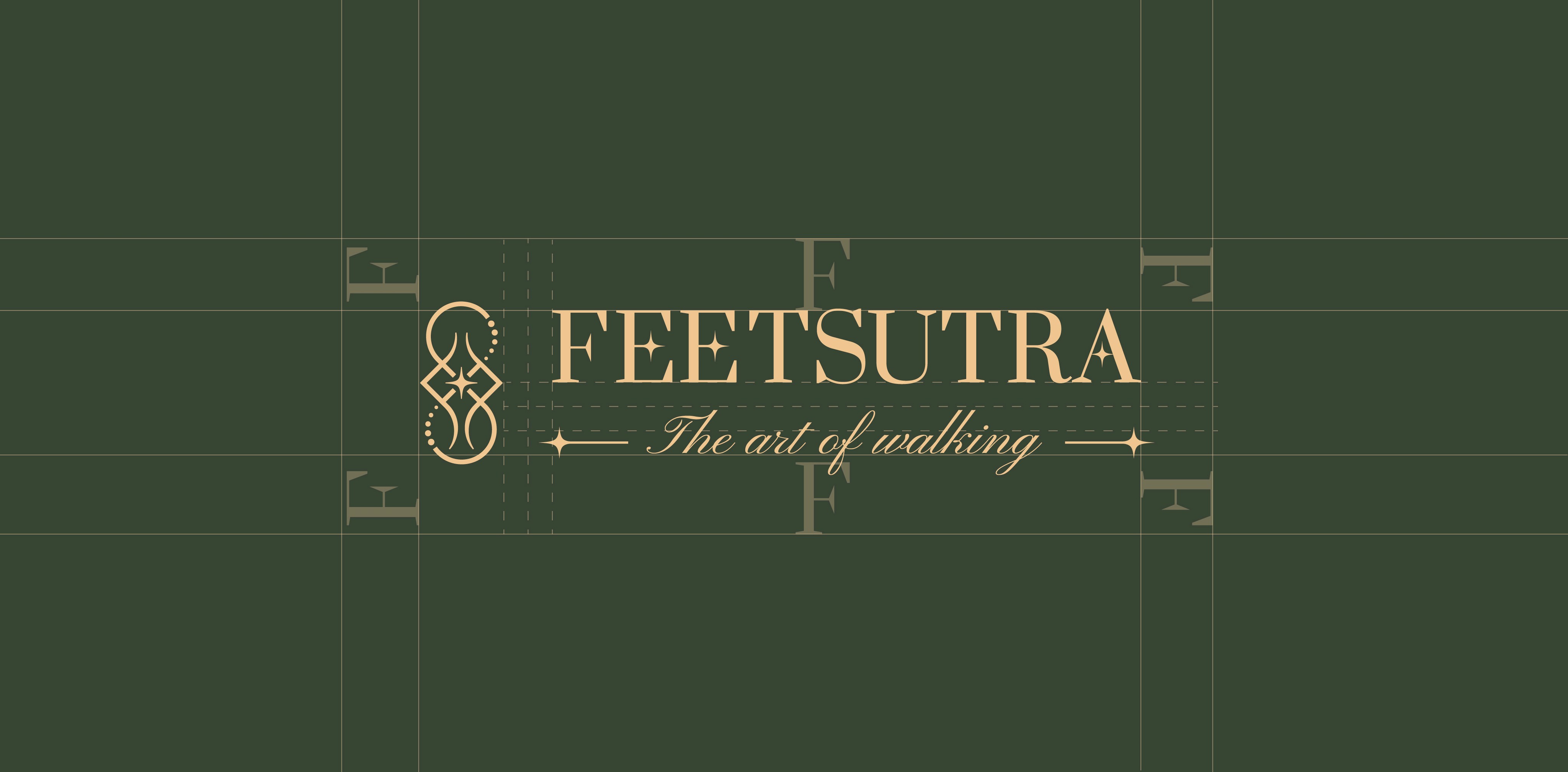
Symmetry and Ambigram:
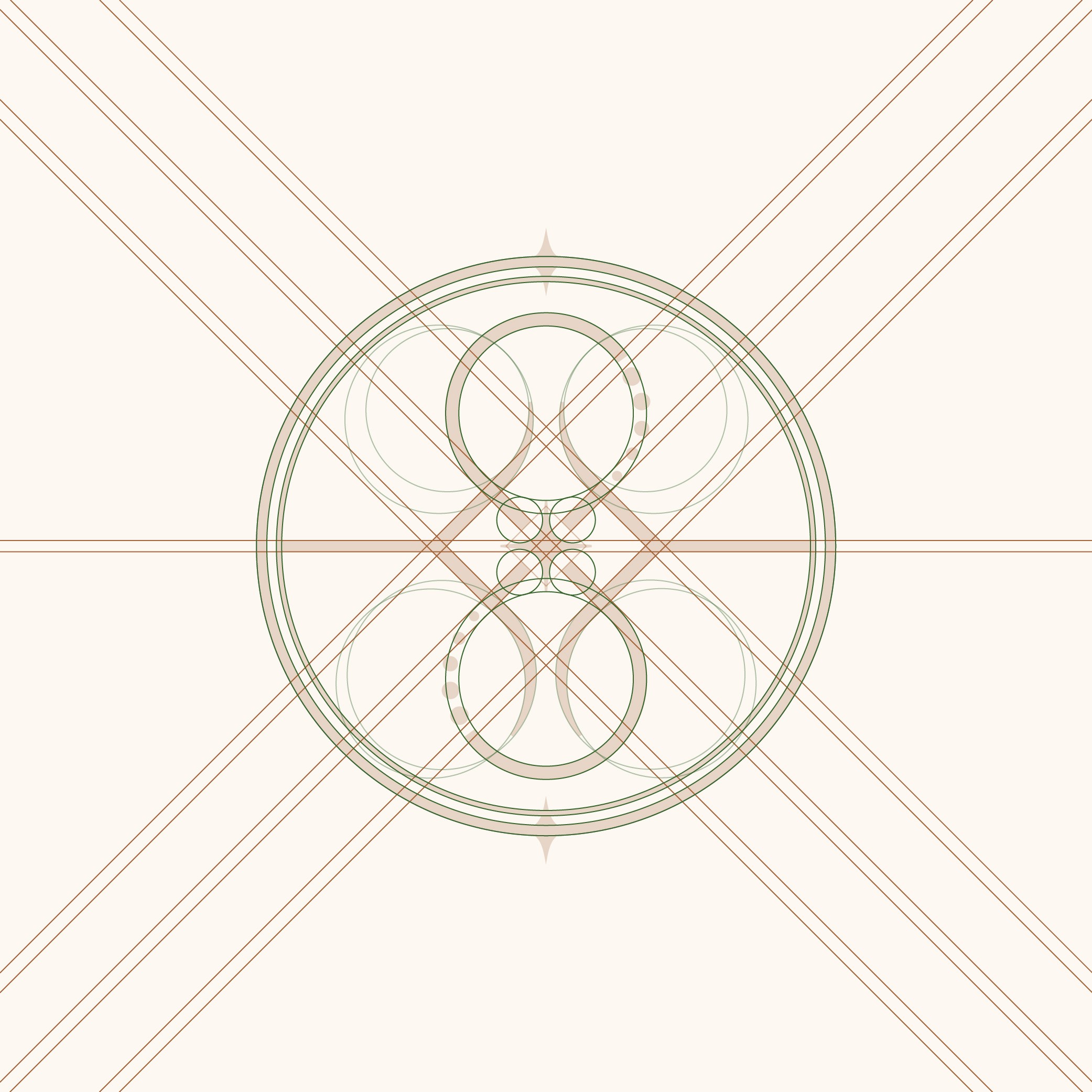
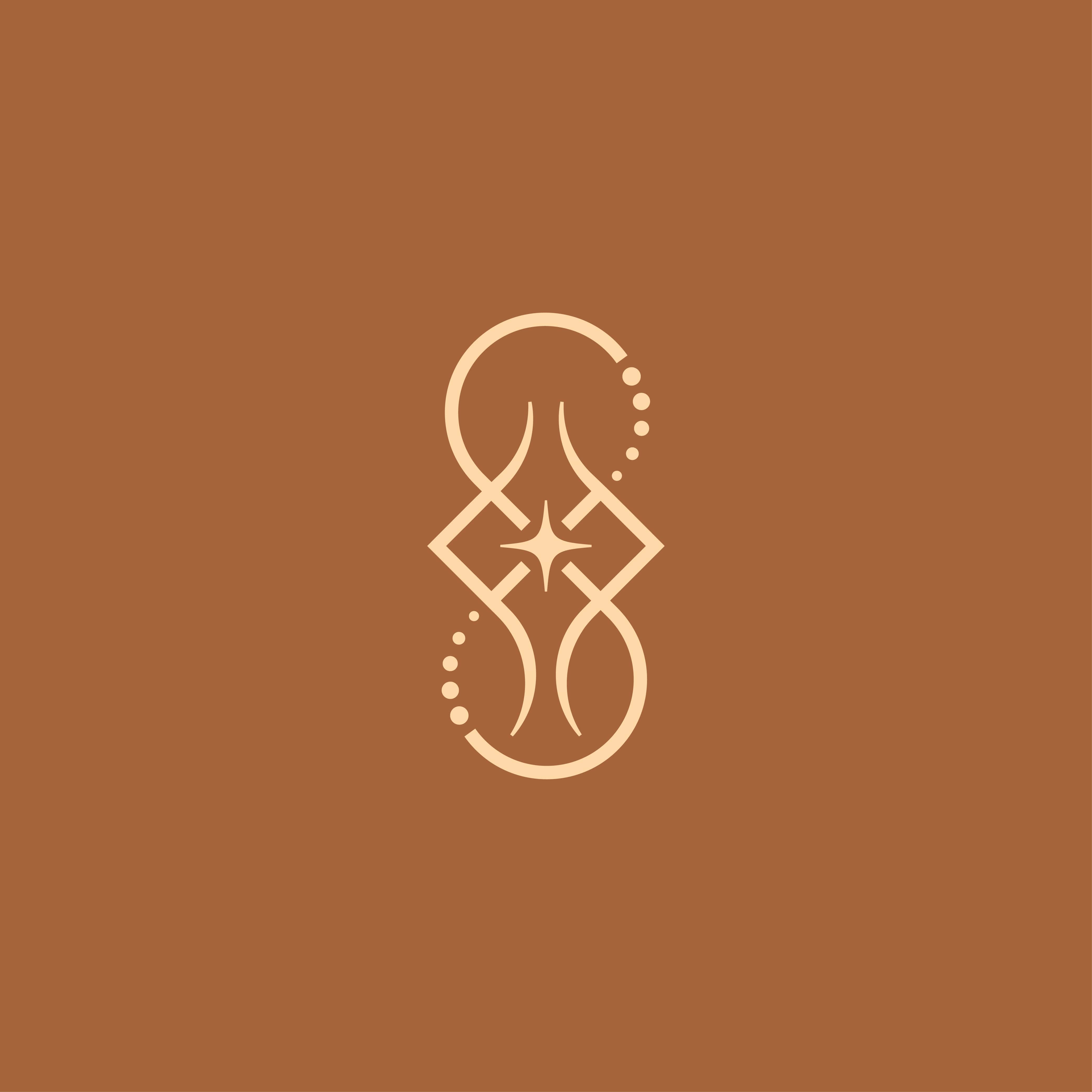
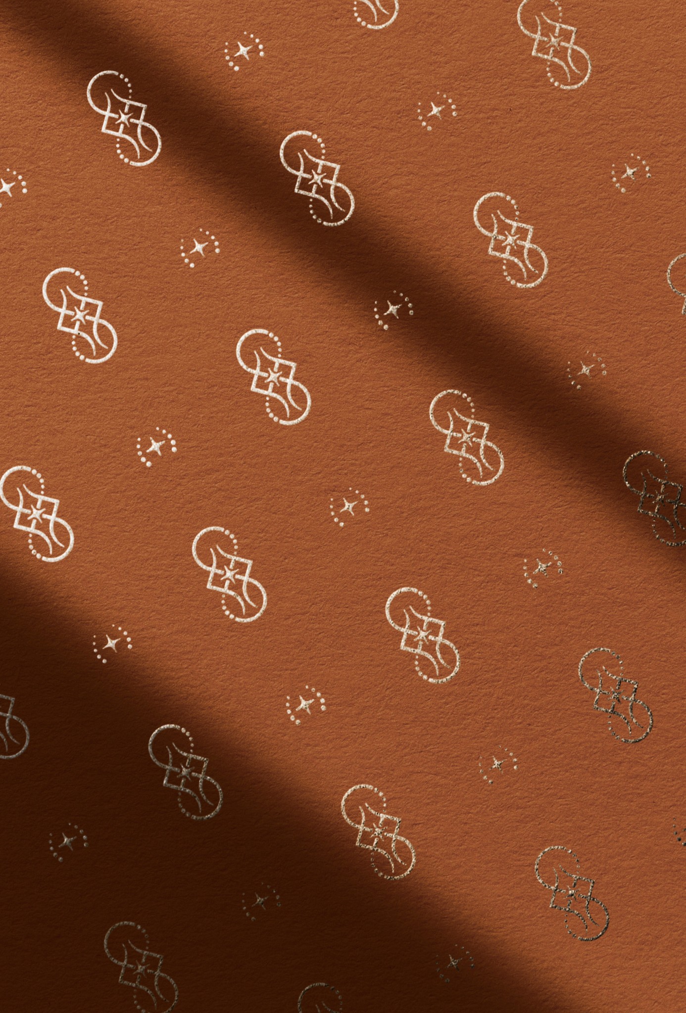
The vision was to design the logo as a versatile, symmetric ambigram, meaning that even if the logo is rotated 180 degrees, it can still be perceived with the same visuals and meaning. This idea stems from the concept that walking is an act of life that leads to progress and growth, regardless of the direction. Almost every element of the logo exists in pairs to establish a symbolic connection to the idea of feet and shoes, which also exist in pairs. The smooth, curvilinear lines that move inwards and outwards from the center of the logo are inspired by the movement of thread and needle, aligning with the brand’s “hand-stitched” characteristic.
The ‘F’ Pillars:
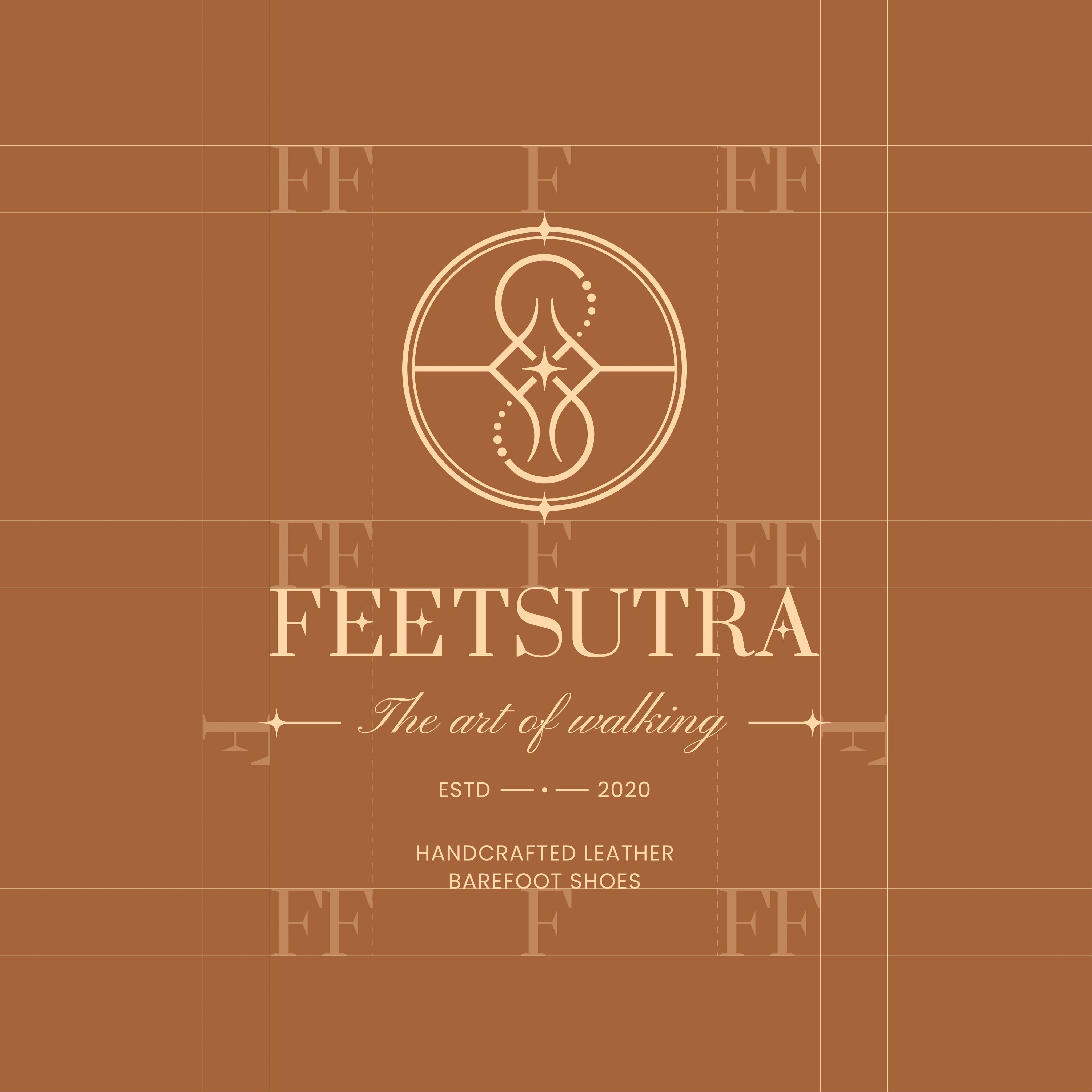
The first element consists of two symmetrically mirrored ‘F’s, representing the confident standing pillars of the logo, much like the two feet of a human being. These ‘F’s are constructed with perpendicular extensions towards the center of the logo, preserving the ambigram-like nature. These serve as the foundation of the logo’s symmetry and balance.
The ‘S’ and its Hierarchy:
Next, the larger ‘S’ stretches from the top to the bottom of the circle, gaining its higher hierarchy from the word Sutra—the “philosophical rule.” The ‘S’ signifies fluidity and movement, evoking a sense of continuous motion, much like walking itself.
Footprint Dots and Infinity Loop:
Curved sets of five dots are placed at the terminals of the ‘S’, representing the imprint of the five toes of a human foot. The dots synergize with the ‘S’, closing it back into the center of the logo. When the entire logo is viewed holistically, these elements form an infinity loop, symbolizing growth in both knowledge and foot health. This connection reflects the barefoot shoe philosophy, which teaches us that overly comfortable shoes may not promote long-term foot health.
Connection to Earth, Sky, and Ground:
The two concentric circles, divided by a horizontal crossbar, symbolize the connections of human beings with their surroundings. The crossbar represents the ground, while the hemisphere above embodies the surrounding environment and the sky, and the hemisphere below signifies the earth. The three stars of the circles carry important meaning: the star at the top symbolizes the sky, the star at the bottom represents the earth, and the larger central star denotes the connection of a human being with both at the very center of it all, where one’s feet touch the ground. When viewed holistically, these circles subtly mimic a compass, symbolizing a journey aligned with the brand’s tagline, “The Art of Walking.”










NEXT PROJECT //
MORE Work //
NEXT PROJECT //
MORE Work //

J&R Guram Campaign Furniture
Brand Identity & Photography
2022
2022

J&R CAMP. FURNITURE
Brand Identity & Photography
2022
2022

J&R Guram Campaign Furniture
Brand Identity & Photography
2022
2022

J&R GURAM
Brand Identity
2022
2022
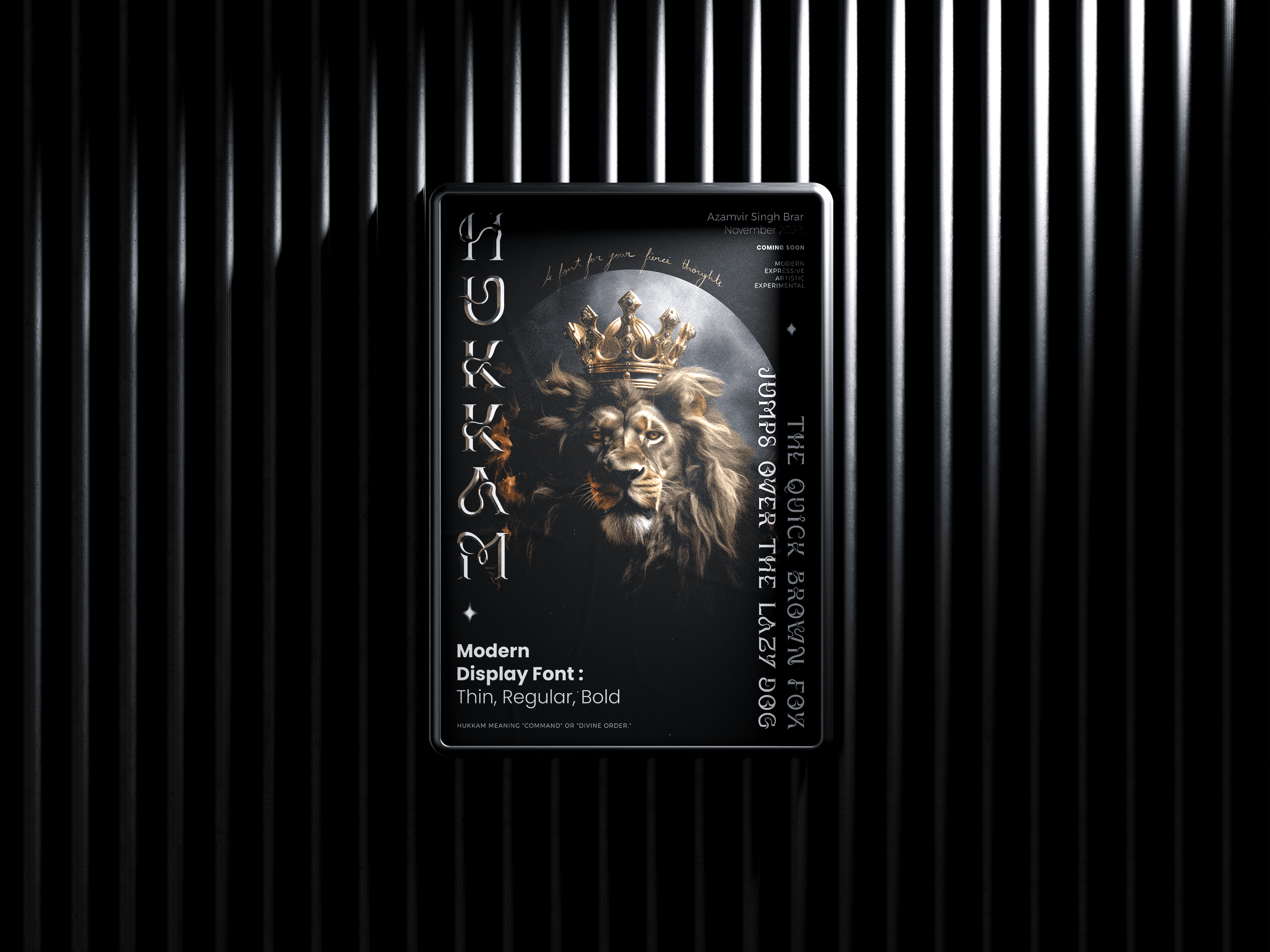
HUKKAM - TYPEFACE
Type Design
2023
2023

HUKKAM - TYPEFACE
Type Design
2023
2023

HUKKAM - TYPEFACE
Type Design
2023
2023

HUKKAM - TYPEFACE
Type Design
2023
2023
az
az
az
az
Brar
Brar
Brar
Brar
Features
Discover
Gallery
Templates
Updates
Features
Discover
Gallery
Templates
Updates
Features
Discover
Gallery
Templates
Updates